EL ALMA
El Alma aims to shine a light on Colombia, the land of coffee. With a country so full of color, wonder and beauty I captured that essence in my branding. Growing up in a Colombian house hold, I Incorporated common colors and patterns found in my environment. These all came together to capture the soul of Colombia.
El Alma is a Colombian cafe and bar serving authentic Colombian tapas and coffee-based drinks. We’ll wake you up with coffee straight from the heart of Colombia, and take you late into the night serving authentic margaritas. Located in Old city, El Alma welcomes everyone with a heart of gold!
Instructor:Katey Stafford

Logo
The process of my logo started out with using common symbols that represent Colombia. Some of these ideas started off pretty simple with using coffee beans, coffee cups, sombreros, and the macaw in the logo. Then narrowing it down to the Palm trees, also known to be the tallest palm trees in the world, commonly found near the coffee regions of Colombia
Color Pallette
My color palette was inspired by the flag of Colombia. Bright yellow that represents the abundance of gold. Blue which represents the surrounding sea. Red that represents the blood spilled fighting for Colombia’s independence. The Colombian flag features brighter colors, I decided to tone them down to feel more welcoming and warm. Complementing those colors is a light brown color.
Menu
I opted for a straightforward menu design, ensuring that categories are distinct, allowing customers to make their selections swiftly. Additionally, I incorporated illustrations throughout for visual appeal. To highlight the happy hour section, I used a darker red background with a pattern, making it stand out prominently.

Packaging
For my packaging I really focused on the pattern placement. This is where the patterns shine the most. I played around with lots of placement and colors to ensure the best combinations. Yellow worked really well with the red and blue. So I kept that consistent with my to go packaging and as well as the coffee bags. Packaging is a extension of the restaurant so I really want the consumers to feel the tone of the restaurant even when they order take out or to go.
Interior
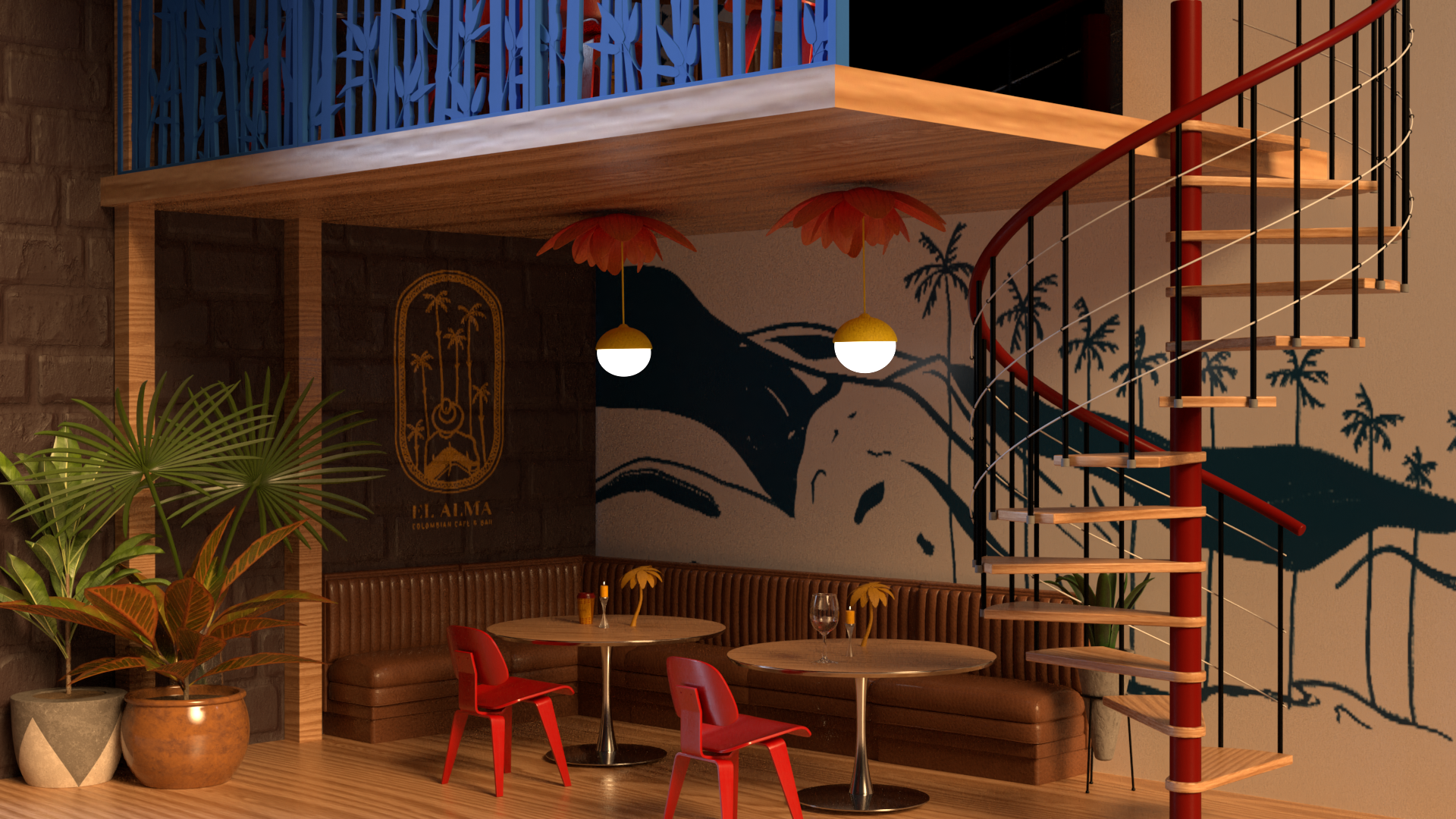
I decided to work with substance stager for the interior of El Alma. Creating the interior was a great experience. It allowed me to visually see the restaurant come to life in these small renders. It gave me a great sense of how branding and the environment can come together to create an atmosphere.
Collateral
El Alma collateral includes various types of tote bags and mugs that highlight patterns and illustrations throughout. I kept the base color of the bags beige so that the illustrations really pop out and standout. The handles complement the colors of the pattern. For the mugs I really want them to have a warm and cozy tone so I used the yellow in combination with the blue and red.


