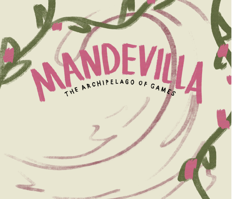
MANDEVILLA
For my thesis, I aimed to develop a project with lots of possibility for packaging and asset creation. thats why I created Mandevilla, a board game offering a assortment of both classic and original games featuring playing cards, dominoes, and a chess board.Players can engage in traditional gameplay or opt for the "Playa" mode, where modified rules introduce twists that allow players to gather resources for their islands.
This collection enhances game nights by providing distinctive experiences for friends and family to relish together. Mandevilla's fusion of timeless and inventive gameplay ensures a diverse range of options, fostering curiosity and enjoyment among players.
Instructor: Scott Laserow

Postcards
These postcards/islands are options for players to select from, each one resembling a slice of fruit. I initiated this project by crafting these fruit inspired islands, as I aimed to infuse the game with a vibrant array of colors. Starting with the fruits enabled me to fully explore the spectrum of colors available.
Additionally, it provided an opportunity to establish a consistent style that would extend throughout the game. This style is characterized by its loose and imperfect nature, intentionally crafted to evoke a sense of playfulness and charm.

logo & packaging
To begin the logo design for Mandevilla, I experimented with different brush strokes. My goal was to fashion an organic logo that truly embodied the essence of nature. As I progressed, I ventured into incorporating elements inspired by the Mandevilla plant itself. However, upon reflection, I found that it made the logo appear overly complex. Opting for simplicity, I returned to my original concept and introduced an arch to infuse a sense of playfulness into the logo

Playing cards
Once the style was established with the postcards, I transitioned into designing the playing cards. My focus initially was on creating the symbols: spades, diamonds, clubs, and hearts. It was crucial that these symbols didn't appear overly vectorized or graphic; instead, they needed to maintain the same playful essence established in the postcards.
Following the creation of the symbols, I proceeded to illustrate the snake, lion, and toucan, taking cues from the placement of these symbols on the cards. Placing the symbols on the cards before illustrating the animals was a strategic decision, as it ensured cohesive flow and harmony between all elements on the card.
In my game, I have three primary assets: game cards, coins, and houses. The game cards represent various games, selected randomly from two decks: a green deck for 1v1 games and an orange deck for group games. Each game is depicted with a playful, hand-drawn icon to maintain a fun aesthetic. To ensure visibility and recognition, I outlined each icon with a black border. The design of the coins was inspired by the back of the game cards, ensuring consistency across all game elements.Using Substance Stager, I crafted the design of the houses, incorporating loosely drawn characters that depict the architectural style commonly found in the Caribbean.
Game assets
THANK YOU
Thank you for checking out my Thesis! Mandevilla was inspired by Caribbean culture, so I knew I wanted a loosely drawn style to add a unique charm and fluidity to the branding, capturing the vibrant essence of Caribbean culture.
In a loosely drawn style, I had some freedom to play with line quality and form. Experimenting with different line weights, from thin, delicate lines to bold, expressive strokes. Capturing the fluidity of Caribbean motifs such as waves, foliage, and dance movements through out the branding.


